
AI Agent setup
Customize
Set how the chat widget looks on your website, its quick prompts, and its greeting and closing messages.
Customize (تخصيص) controls the chat widget your customers see on your website: its name, colors, size and position, the quick prompts that help customers start a conversation, and the greeting and closing messages. The page has three tabs: Appearance (المظهر), Quick Prompts (المطالبات السريعة) and Interactions (التفاعلات).
How to open it
In the sidebar, open AI Agent Setup (إعداد الموظف) and choose Customize (تخصيص). The Appearance tab opens by default.
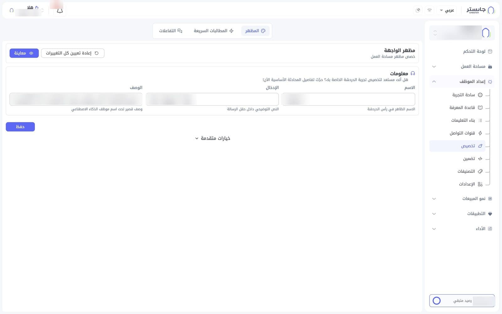
Appearance
The tab is titled Interface appearance (مظهر الواجهة) and has two buttons at the top:
- Reset all changes (إعادة تعيين كل التغييرات): undo your changes.
- Preview (معاينة): preview the widget.
Information
Three basic fields:
| Field | What it controls |
|---|---|
| Name (الاسم) | The name shown in the chat header |
| Input placeholder (الإدخال) | The hint text inside the message field |
| Description (الوصف) | A short description under the AI Agent's name |
When you're done, click Save (حفظ).
Advanced options
Click Advanced options (خيارات متقدمة) under the Information card to show the rest of the settings.
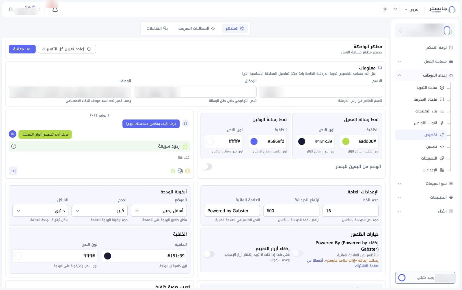
Customer message style (نمط رسالة العميل) and AI Agent message style (نمط رسالة الوكيل): each has two colors, Background (الخلفية) and Text color (لون النص). Each color has a field for its hex code, with a swatch next to it showing the current color.
| Setting | Default |
|---|---|
| Customer message background | #aadd00 |
| Customer message text | #181c39 |
| AI Agent message background | #5869fd |
| AI Agent message text | #ffffff |
- Right-to-left mode (الوضع من اليمين لليسار): a switch to show the widget in right-to-left layout. Off by default.
- Next to these cards, a sample conversation shows the chosen colors.
General settings (الإعدادات العامة):
| Field | What it controls | Default |
|---|---|---|
| Font size (حجم الخط) | Chat text size in pixels | 16 |
| Chat height (ارتفاع الدردشة) | Chat window height in pixels | 600 |
| Watermark (العلامة المائية) | The text shown in the watermark | Powered by Gabster |
Visibility options (خيارات الظهور):
- Hide Powered By (إخفاء Powered By): don't show the watermark text.
- Hide rating buttons (إخفاء أزرار التقييم): hide the like and dislike buttons in the chat.
Both switches are off by default.
Hiding the watermark requires the Remove Gabster branding (إزالة علامة جابستر) add-on. You can add it from the subscription page with the Add it from the subscription page (أضفها من صفحة الاشتراك) link.
Widget icon (أيقونة الودجة): controls the floating widget icon on your page.
| Dropdown | What it controls | Default |
|---|---|---|
| Position (الموضع) | Where the widget appears on the page | Bottom-right (أسفل-يمين) |
| Size (الحجم) | Size of the floating widget icon | Large (كبير) |
| Shape (الشكل) | Shape of the floating widget icon | Circular (دائري) |
Background (الخلفية): two colors for the widget button — Background (the button color, #181c39 by default) and Text color (the text and icon on the button, #ffffff by default).
At the bottom of the page is a Set background image (تعيين صورة خلفية) card.
Quick Prompts
Quick prompts are short buttons in the chat window that let a customer start a conversation with one tap.
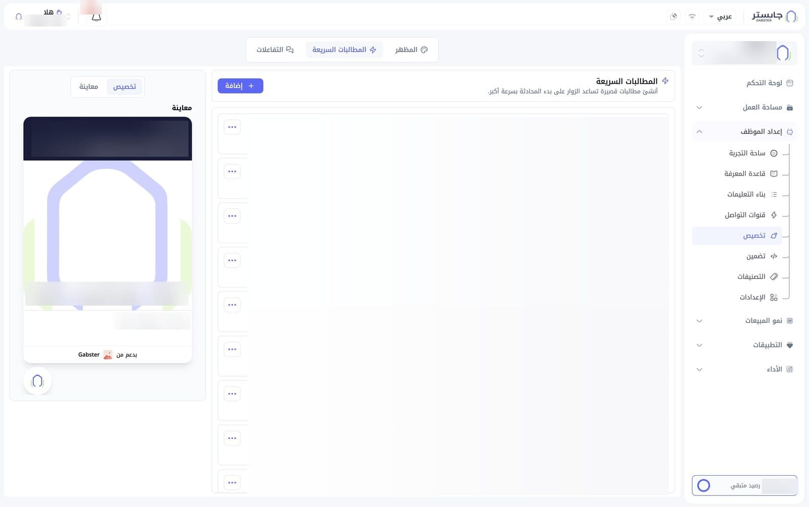
- Add (إضافة): create a new prompt.
- Each prompt has a card with a short title (the label on the button in the widget) and the full question below it.
- The three-dot button (⋯) on each card opens the prompt's options.
On the left, a widget preview shows the name, description and input placeholder from the Appearance tab, the prompt buttons, and the watermark text at the bottom. Above the preview is a Customize (تخصيص) / Preview (معاينة) switch.
Interactions
On the Interactions (التفاعلات) tab you manage the greeting and closing messages that appear around the chat.
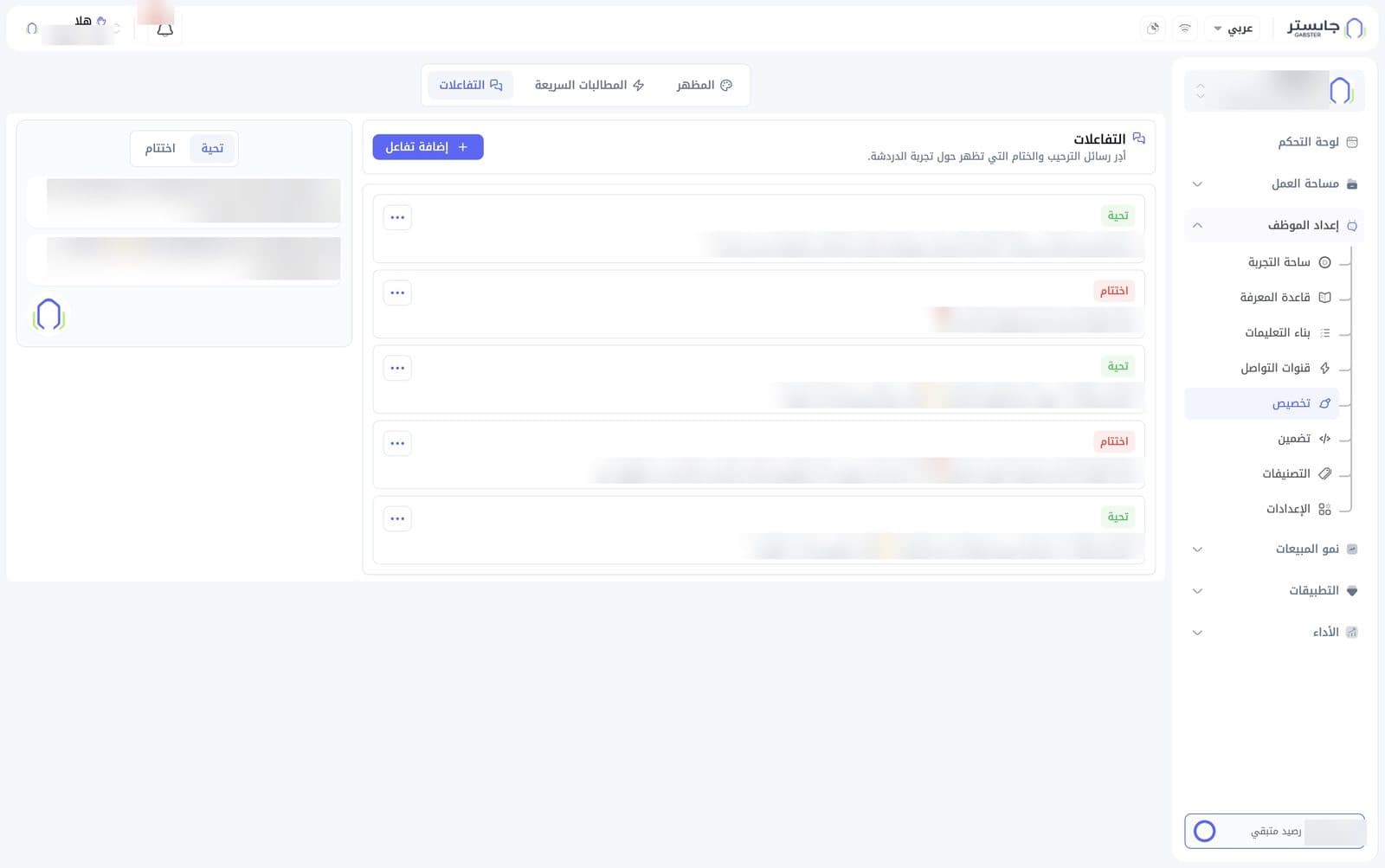
- Add interaction (إضافة تفاعل): add a new message.
- Each message has a card with a type badge and its text:
- Greeting (تحية), green badge: a welcome message.
- Closing (اختتام), red badge: a closing message.
- The three-dot button (⋯) on each card opens the message's options.
- On the left is a preview with a Greeting / Closing switch above it. With Greeting selected, the greetings appear as bubbles above the widget button.